Monday, December 16, 2013

More Hot Type to Savor with the Arrival of the Monotype Composition Caster

MORE HOT METAL ACTION IS TAKING SHAPE now at the Tampa Book Arts Studio! The turn-of-the-century typecasting marvel—and the gold standard for fine printing and book composition in its day—the Monotype Composition Caster has arrived at the Tampa Book Arts Studio! It’s taken its place in the Studio’s hot-type “foundry corner” to join with its typecasting kin, the Intertype, the Ludlow, and the Monotype “Orphan Annie” caster.


TBAS Director Richard Mathews and Letterpress Coordinator Carl Mario Nudi
 stand with the newly unwrapped machine still anchored to the pallet.
Earlier this year, having just completed Monotype University, TBAS Letterpress Coordinator Carl Mario Nudi and Tampa Press Publishing Assistant Joshua Steward visited typefounder and printer Ian Schaefer at his studio in Lititz, Pennsylvania, to rig and prepare the caster and keyboard for shipment to Tampa.
Tampa Press Publishing Assistant Joshua Steward
and printer, typecaster Ian Schaefer wrap the caster
with pallet wrap.

Carl and Josh used 2x6-inch lumber to construct a custom pallet that fit around the narrow base of the caster, giving it a wider footprint for stability during transport. Steel eyebolts were driven into the boards, and ratchet tie-down straps and heavy cord were threaded through the base and back through the machine to anchor it to the base. The caster was then covered with a blanket, wrapped in heavy tarps, and sealed with layers of pallet-wrap to weatherize it for travel and storage on its journey south.


Shaking hands over the fully-wrapped caster, now ready to be shipped.
Dave Seat of Hot Metal Services in Mount Juliet, Tennessee, was picking up some equipment in the Pennsylvania area, and we were able to arrange to hitch a ride, first from Pennsylvania to HMS in Tennessee, where our Monotype was happy to hang out until one of Dave’s service trips could bring it further South to Tampa, where we welcomed to its new home in the Book Arts Studio.
     
     Accompanying the machine was a curious but necessary supporting cast of many replacement parts, molds, and matrices that had to be sorted, cleaned, cataloged, and stored. Carl undertook this task and made a place in the studio for each piece and part. Once this was done and the parts cleared away, the unwrapping of the machine could begin, one layer at a time.
Left: TBAS Director Richard Mathews begins cutting through the many layers of pallet wrap.
Right: Letterpress Coordinator Carl Mario Nudi releases the cords anchoring and protecting the machine.

After the unpacking, the space where the caster was going to be settled needed to be made—fitting neatly in the Studio between the Intertype and the “Orphan Annie” Monotype Caster—though, this required the Intertype to be moved a few feet to the left, while the “Orphan Annie” needed to be moved a few feet to the right:

Once this was done, the Monotype Composition Caster was coaxed into its permanent place in the Studio and lowered to the floor:


 – Thanks to Ian Schaefer and Dave Seat –
For their hard work, diligence, and for the knowledge they’ve been so willing to share.

Thursday, November 21, 2013

Lankes Keepsake Is a Hit at Frost Symposium


   The Tampa Book Arts Studio and the University of Tampa Press have just completed a special limited-edition letterpress print of a previously unpublished sketch of poet Robert Frost made by the wood engraver J.J. Lankes, well-known as the illustrator of Frost's books.


The keepsake folder with its letterpress block print.

     Lankes met with Frost at the South Shaftsbury, Vermont, train station in the summer of 1924—their first time meeting face-to-face after corresponding for almost a year. Frost and his son came to meet Lankes at the station, and they returned by horse and buggy to Frost's home and farm where the two collaborators talked until the early hours of the next morning. It was during this late-night conversation that Lankes made his first, quick sketch of Frost.
     The original drawing, from the collection of Lankes scholar Welford D. Taylor, is reproduced in facsimile with its original pencil notes on the cover of a folder enclosing the letterpress print. The inside pages of the folder include "A Note on First Impressions of Robert Frost”  by Taylor and the transcription of the letter Lankes wrote to his wife describing his first impressions of Frost after their meeting.
    In the letter, Lankes describes Frost as looking like “a granite boulder” and “solid like a field when one is mown.”
    “Well, we talked the night thru,” Lankes writes. “The roosters started to crow as I got into bed and then the birds began to peep, and day came on.”


Lankes’s sketch was converted to a copper engraved block for printing.

     A copper relief block, adapted from the original Lankes sketch, was photo-engraved for us by Owosso Graphic Arts in Owosso, Michigan. Richard Mathews and Joshua Steward then printed our limited edition on the 1848 Hoe Washington hand press that Lankes purchased to print his woodcuts. 


Lankes’s Hoe Washington Press at the Tampa Book Arts Studio.

     An edition of seventy-five prints was pulled on dampened Whatman handmade paper from the Lankes estate. The first 35 prints were presented as keepsakes to participants in the Robert Frost Symposium, held in November 2013 at the University of Richmond, in conjunction with the major exhibition opening there, Julius J. Lankes: Survey of an American Artist.
     The forty remaining copies of the print and folder are available for purchase from the UT Press website.
     According to Welford Taylor, the keepsake was well-received at the symposium. “The Keepsake was more than a hit,” he said. “It became, then and there, a classic.” 

Wednesday, November 13, 2013

Tampa Book Arts Studio Explores New Dimensions at Monotype University Eight


     This fall, Terra Alta, West Virginia, became home to Monotype University 8 (this being the eighth edition)—a week-long course in the use and maintenance of Tolbert Lanston's turn-of-the-century mechanical wonder, the Monotype Composition Caster. This year was a chance to explore a new dimension of Lanston’s marvel, thanks to an addition to  the Monotype curriculum: an innovative composition interface using a Mac computer.

     
     Two Tampa Book Arts Studio associates took part in the great educational opportunity in anticipation of the arrival of a Monotype Composition Caster at the Tampa Book Arts Studio later this fall. Letterpress Coordinator Carl Mario Nudi and Tampa Press Editing and Publishing Assistant Joshua Steward joined four other students from across North America to complete the latest hot-type class: Rob LoMascolo (New York), Kevin Martin (Ontario, Canada), Mason Miller (Maine), and Jeff Meade (California).

     Monotype University was hosted and taught by printer, author, and Monotype scholar Richard L. Hopkins of Hill & Dale Press and Typefoundry in Terra Alta. Rich is the author of Tolbert Lanston and the Monotype (University of Tampa Press, 2012). He was founder of the American Typecasting Fellowship and has been publisher and editor of the ATF magazine for nearly forty years. Assisting Rich with the university this year was Bill Welliver, long-time printer, and inventor, designer, and builder of the CompCAT (“Computer Aided Typecasting”) digital typesetting system—commonly known as the “Welliver System” or “Welliver Interface.”

Clockwise, from left: Joshua Steward, Rob LoMascolo, Jeff Meade,
Kevin Martin, Mason Miller,  Bill Welliver, Rich Hopkins, and Carl Mario Nudi.
     The first few days mainly involved arriving, getting acquainted, touring Rich Hopkins’s press and typefoundry—or The Chapel as he calls it (complete with stained glass window)—and becoming familiar with the setup. After getting settled in, much of the early part of the week was spent observing Rich cast and set type on a Monotype composition caster. While operating the machine, he offered advice and solutions for common problems and hangups, mentioned things to watch for, and answered the students’ many questions.

TBAS Letterpress Coordinator Carl Mario Nudi
and Bill Welliver discuss the CompCAT software
     A large portion of Monotype 8 was dedicated to learning the installation and use of the Welliver Interface, a way to connect a Mac computer to the nineteenth century Monotype caster. This enables typesetting from a laptop or desktop keyboard, in place of the original Monotype keyboard that punched a perforated paper tape or ribbon that was then run through the machine, a bit like a player piano, causing the caster to produce pieces of type instead of musical notes. The Welliver Interface is composed of both hardware and software components: the hardware is a mass of clear tubing, bound together, routed through a panel of air valves and circuit board, culminating in a steel bar with a row of small air holes that is clamped directly onto the paper tower of the Monotype Composition Caster. The software (CompCAT) itself is divided into two parts: the composing software (eRibbons), and the Caster Control Application, which controls the basic functions of starting, stopping, or repeating a line of a “ribbon,” or for the selection of a pin combination to cast a specific character in the matrix case that’s placed in the caster at that time.

Rob LoMascolo (in green), Joshua Steward
(center, installing the Welliver hardware),
and Kevin Martin (right) listen in to Rich.
(Note the blue stained glass "Chapel" window.)
     Because Rich was getting a second Interface installed for a second composition caster while Bill was in town, the students who own—or plan on owning—the Welliver interface and hardware were able to “play” with the most recent build of the hardware; this was convenient, as part of the troubleshooting for the mechanical difficulties of installing the system on a caster for the first time involves an initial installation, checking the adjustments, uninstalling again, and repeating that possibly many times, until all problems have been eliminated one by one, and all valves, air pressures, tubes, joints, screws, etc., have been finely calibrated and able to consistently cast good type. It was greatly beneficial to the students to work this way, as well as to work through all aspects of the software, and do it all with the inventor right next to them.


Joshua Steward, composing
on the Monotype Keyboard
     Over the course of the week each student was given the task of designing and arranging two written works: one composed on the Monotype Keyboard and one composedf using eRibbons, the Welliver digital composition software. Both versions were then to be cast on the Monotype Composition Caster and printed on-site in Rich’s print room. These ultimately were compiled as a portfolio of each student’s work. About midway through the week, as the novice students were getting a handle on the machines, Bill and Rich split them into two groups, with Rich teaching the operation and intricacies of the Monotype Keyboard while Bill took the more modern-minded to teach the use of his software with a computer keyboard. A day later, the groups switched to catch up on what they’d missed the previous day. As part of Bill’s lessons, the students each chose a typeface that hadn't yet been added into the database of the Welliver Interface, and using the vintage Matrix Case Arrangement (MCA) paperwork of type foundries, each student assigned the characters in that font to each position on a digital MCA.


Rich (left) prints on a Heidelberg Windmill platen press while
Rob LoMascolo and Joshua Steward look on. (Bill Welliver at far right.)
     Throughout the week, a variety of other lessons and demonstrations were given. A portion of one day was filled by watching Rich take apart, clean, and reassemble a mold. It was a chance for an up-close and personal look at the “guts” of a beautifully engineered antique that maintains its precision and runs “like a clock” when casting perfect pieces of type. Additionally, some students took turns removing the bridge of the caster and installing the mold.

     Even downtime was filled with Monotype in various ways, but often there was a break in the day when those who had brought lunch took time out to sit around the Hopkins dining room table and talk all things casting, printing, and otherwise. Others worked through lunch, either progressing on their projects or poking around Rich's basement studio. However, one notably beautiful day was enjoyed as a group, eating pizza, talking, and laughing on Rich’s back porch in perfect 78-degree weather.


     The students spent their last few days finishing up casting and printing their projects, as well as working on their own pet projects: a few composed and cast additional galleys of type; some helped Bill Welliver deconstruct a rusted-out Monotype (the first Rich had owned and used)—to strip it down for spare parts, as well as for the learning opportunity; and two were chosen to compose and design the diplomas for Monotype University 8, to be presented on the final night at a celebratory dinner.


From left: Jeff Meade, Carl Mario Nudi, Rich and wife Lynda, Mason Miller, Kevin Martin,
Bill Welliver, Joshua Steward. (Rob LoMascolo not pictured.)
* * *


Graduates and Faculty of Monotype University 8
From left: Carl Mario Nudi, Rob LoMascolo, Mason Miller, Rich Hopkins (kneeling),
Jeff Meade, Bill Welliver, Kevin Martin (kneeling, with forme), and Joshua Steward.
Congratulations to the graduates!

Thanks to Rich and Lynda Hopkins for their patience and hospitality.
Thanks to Rich Hopkins and Bill Welliver, whose contributions to typecasting and letterpress printing will be remembered and carried forward by their students in the years ahead.

Saturday, October 26, 2013

In Memoriam: Henry Wehle, 1939-2013

Henry demonstrating the Hammond Glider, January 2013.
     Henry Edward Wehle was born and raised in Tampa, where he graduated from Jesuit High School in 1957.  After serving in the Florida Army National Guard, he and his twin brother Gerald founded and operated Tampa Thermogravers, Inc., for over forty years.  When he and Gerry decided to retire, they looked just down the street from their shop on Kennedy Boulevard to the University of Tampa, where they had heard that the University of Tampa Press had an interest in keeping letterpress printing alive.
     Henry and Gerry donated much of their foundry type, letterpress equipment, and their vintage Intertype machine to the university’s Book Arts Studio, and Henry agreed to be our volunteer expert on its history and operation.

Henry setting type on the Intertype for MFA graduate students and visiting writer Karen Russell (far right), Pulitzer Prize finalist and MacArthur Foundation Fellow, at the Book Arts Studio in January 2013.
     Since that time, hundreds of students, professors, visiting writers, artists, and serious hobby printers have enjoyed the chance to learn about typesetting on the Intertype and Linotype machines from Henry.  He had a knack for bringing the history and operation of the machine to life.  And when he talked about it, his interest and enthusiasm were contagious.  The twinkle in his eye and the smile on his face let you know that he still got a kick from the sheer mechanics and ingenuity involved in making lines of type drop out like clockwork.

Henry explaining the Intertype “elevators” and the slug delivery system to grad students.

Henry at his Intertype with North American Intertype guru Don Black, of  Don Black Linecasting, Toronto, Canada. Monotype expert Richard L. Hopkins is in the background with them at the First Florida Letterpress Wayzgoose held in February 2013 at the Tampa Book Arts Studio.

     Henry was a good friend and a dedicated craftsman.  His generosity  in passing along some of his knowledge and experience will be cherished—and he will be deeply missed.

Henry sharing the old technology with new generations.


Wednesday, July 10, 2013

National Book Award Winner Denis Johnson visits the Tampa Book Arts Studio

Denis Johnson hand-cranking the Vandercook 4

I. Denis Johnson becomes a limited-edition letterpress printer
National Book Award winner and Pulitzer Prize finalist Denis Johnson visited the Tampa Book Arts Studio on June 19 as part of the fifth residency of the MFA in Creative Writing at the University of Tampa. Fitting the visit in between a workshop earlier in the day and a reading in the evening, Johnson and the MFA students were invited by the TBAS for a tour of the studio and some hands-on letterpress printing. This included each student being given the opportunity to print a keepsake: a broadside with the closing lines from Johnson's 1992 book Jesus’ Son, designed and hand-set by the printers of the TBAS. After each deckle-edged sheet received its final turn through the press by each student, Johnson signed the broadside while the ink was still wet.


TBAS Letterpress Coordinator Carl Mario Nudi instructing Tampa Review Online
Blog Editor Coe Douglas on the Ludlow Typograph typecaster.
(Photo courtesy of Steven Lansky)

Denis Johnson signing broadsides on the imposing stone.

II. Printing the Denis Johnson Broadside
The design and printing of the broadside is a story in itself—with unexpected plot twists along the way. Denis Johnson was originally announced as a guest writer for the MFA winter residency last January, and the TBAS began work on a keepsake, choosing to set his final lines from Jesus’ Son:


All these weirdos, and me getting a little better every day
 right in the midst of them. I had never known,
never even imagined for a heartbeat,
that there might be a place for people like us.

We had begun printing the letterpress broadside on imported Arches paper and had finished the first three colors—two shades of grey and one of black, including a photoengraved block of silhouetted heads, printed in pale grey. When Johnson unexpectedly had to be rescheduled at the last minute and a keepsake suddenly needed to be made instead for prize-winning novelist Karen Russell’s visit to the TBAS in January of this year, the silhouette block was pressed into service to become “swamp people,” printed in green, for a limited-edition broadside on Milkweed paper in tribute to her book, Swamplandia.

Given a chance to re-evaluate our plans for the Denis Johnson broadside, we used the additional time to create a more dynamic design. This included a decision to overprint the silhouettes, hiding them beneath brown cactus and red-orange rock formations and using the hints of grey that showed through as shadow for the rocky plateaus and mountains. Also, because the pre-printed colophon now had incorrect dates and information, we creatively “edited” it to include the right details. The broadside had passed through our presses five times before Johnson and the students added their sixth and final letterpress impression to complete it.


The broadsides drying after the brown printing run.
Note grey silhouette heads in the background.


The broadsides drying after the first orange printing run.

The final Denis Johnson Broadside
Note the strikethroughs and corrections for the
words 'third' and 'January' in the colophon.

Thanks to Denis Johnson!

***
The Tampa Book Arts Studio also thanks Jeff Parker and the MFA Program at the University of Tampa for facilitating Denis’s visit.

Thursday, June 6, 2013

Vintage Printing Blocks Enrich Our Growing Letterpress Collections

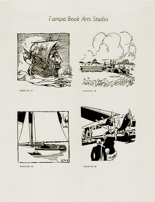
Recently, the Tampa Book Arts Studio received a generous donation of nearly fifty small letterpress cuts. Initially these were something of a mystery to us, due to a puzzling arrangement of letters in the logotype found in the corner of each (see above). Through research we were able to identify the lettering as “HUX” and the blocks as having been produced by the Huckins-Smith Studios, an early 20th century decorative illustration studio out of New York City providing “inspirational suggestions for advertisers—an endless variety of ideas for every illustrative need.”


Marketing their images as “Hux Cuts,” the company was widely known for producing relief blocks for cachetmakers— the proper name for those who create First Day Covers (decorated envelopes for the debut of a stamp, designed to include the stamp and first-day postmark of the city where it it is first issued). The blocks were used for FDCs mainly in the late 1920s and early 30s, but continued to be in occasional use until the 50s.

The cuts now in our collection are each approximately three inches square—Hux’s “Large” size—and were originally sold for $3.00 apiece.


After properly identifying their manufacture, with the help of our special collections chief, J.B. Dobkin, we were able to acquire a 47-page Hux Cuts specimen book and have identified and found serial numbers for our blocks.


With our new blocks, we've printed a small portfolio of proofs as a catalog for our Special Collections:


Some of the blocks are two-color, as shown by these Christmas-themed illustrations:


Thanks to our anonymous donor and to J. B. Dobkin 
for these great new additions to our collections

Tuesday, May 21, 2013

Farewell to a Gentleman Printer


The Tampa Book Arts Studio mourns the loss of our friend and mentor Leland Hawes, who passed away May 18. He was a lifelong amateur printer and journalist, and one of Florida's finest professional journalists.  He is especially remembered in Tampa for his “History and Heritage” columns in the Tampa Tribune, but friends and colleagues around the country will miss him deeply as one of the leading amateur letterpress printers. He served many years as President of the American Amateur Press Association where he inspired countless others with his passion for a well-told story and a well-set line of type.

He is pictured above in his home printshop last year, shortly before we moved his Chandler and Price platen press, together with many cases of type and a good amount of other printing equipment, to a new home in the Tampa Book Arts Studio. His press was a headliner at the recent Florida Letterpress Wayzgoose held here this spring (see the previous post) and we were pleased to have him with us to celebrate. It was a landmark occasion in the short history of the TBAS. As a founding friend he could appreciate the progress we have made in just five years, having moved from an improvised warehouse location to the refurbished space where we can host events like a Wayzgoose. He played an active part in the life of the Studio, as he helped sort type and spacing, offered advice about the placement of equipment, and pulled some of the first sheets printed here. He will continue to serve as an example of how to share talent and passion in friendship and fellowship. He was a friend, an amateur, and a professional in the fullest and deepest senses of those words.

Monday, March 4, 2013

The First Florida Letterpress Wayzgoose


Nearly 50 printing enthusiasts attended the Inaugural Florida Letterpress Wayzgoose held at the Tampa Book Arts Studio on Saturday, February 23rd. Among other keepsakes, they helped print the one above on the C&P platen press recently donated by Leland Hawes.


Take a look at these photos taken by Studio associate Sean Donnelly:

https://picasaweb.google.com/105398920404264602493/WayzgoosePhotosBySeanDonnelly2232013?authkey=Gv1sRgCPeLxY62p7WAGA

And these links to more photos of the day's events:


Jan has her's on Flickr at:


And Melissa has a great web site where she posted her photos:


and quickie tutorial on how to make paste paper here:


And our fabulous C&P master, Gary, posted his on his blog at:


Wednesday, January 23, 2013

A Keepsake for Karen Russell & MFA Students

The Tampa Book Arts Studio welcomed guest writer Karen Russell and MFA residency students on Friday, Jan. 3, 2013, for some hands-on letterpress printing just outside "the swamp.” The quotation used on the keepsake is from Russell’s novel Swamplandia, set in the Florida Everglades, and though the ’glades begins a little further south, Tampa has a claim on swampland, too—which makes us all “swamp people.” 

Participants printed two colors on the keepsake, using two different presses, and also saw a demonstration of how to make decorative paste papers, watched slides and videos about the letterpress era, and shared a variety of refreshments. This is the third time the Book Arts Studio has hosted this event for graduate students in the writing program—with about 90 participants this time around.

Every student was presented with a portfolio to carry their paste paper samples and hand-printed keepsake.

Retired printer Henry Welhe demonstrates the Intertype to MFA student Charles Wheeler and guest writer Karen Russell.

Friday, January 18, 2013

The first Florida Letterpress Wayzgoose
(coming soon)


Fellow printers have recently been invited to attend the first FLORIDA LETTERPRESS WAYZGOOSE at the Tampa Book Arts Studio. The day will be a chance to meet and talk shop—and there will be tables set up for a SWAP MEET and DISPLAY. 

Gary Johanson will be on hand to demonstrate platen press printing. Peter and Donna Thomas will display some of their work and demonstrate hand papermaking and their miniature Hollander beater.   There will be hot metal demonstrations on our Intertype, Ludlow Typograph, and Monotype caster. We'll also print a keepsake or two that day, with demonstrations of printing on a Washington Hand Press and a Vandercook.

We anticipate welcoming some special guests: LES FELLER, letterpress printer and retired founder of the Printer's Row Printing Museum in Chicago, will be on hand to chat about some of the antique broadsides, blocks, and presses he has donated to the Tampa Book Arts Studio. DON BLACK, of Don Black Linecasting in Toronto will be here to answer Intertype questions and talk letterpress. And RICH HOPKINS, whose new book on the Monotype will be hot off the press, will talk about the past and future of Monotype casting and sign copies of TOLBERT LANSTON AND THE MONOTYPE: THE ORIGIN OF DIGITAL TYPESETTING.

[For printers & guests who are planning on attending and need surrounding hotel information: The University of Tampa has a hotel list of discounted nearby hotels and info about the campus shuttle.]

Publishing, Printing, and Book Arts Finals

University of Tampa students from English, art, and creative writing recently completed the first full-semester course in Printing, Publishing, and Book Arts at the Tampa Book Arts Studio this fall. Along with learning how to hand-set type and operate a press, the students were also taught papermaking, bookbinding, typographic design, marbling, paste paper techniques, and other related skills. 

Azizeh Mubaslat, left, and Claire Barley finish up their joint signature for the class project, a hand-bound book entitled Inspiration 2012.