Wednesday, December 23, 2015

Nearing the end of the Rich Mouse's tale . . .

With the end of 2015 near, the completion of “The Rich Mouse” limited-edition project at the Tampa Book Arts Studio is also in sight!

Early this week, Richard Mathews, Carl Mario Nudi, and Joshua Steward completed the printing of the unique, Lankes-inspired decorative papers for the hardback covers on the Vandercook 219AB proof press.

***

“The Rich Mouse” is a hand-bound, limited letterpress edition of the nearly-lost short story by woodcut artist J. J. Lankes, accompanied by his woodcut illustrations and printed on his 1848 Hoe Washington iron handpress here at the Tampa Book Arts Studio.

Since the completion of the printing of the four, eight-page signatures of “The Rich Mouse” story on the Lankes handpress, we have continued to work on the various elements needed to complete the project. In addition to the final letterpress run of these cover sheets, we also designed and typeset the title and spine labels, and the other premiums offered as rewards for contributing to the Kickstarter campaign used to raise funds for the production of the book.

The signatures, cover papers, and title labels soon will be ready to deliver to bookbinder David Barry of Griffin Bookbinding in St. Petersburg, who will hand bind each of the 150 copies of the book.

TBAS Associate Sean Donnelly's near-daily documentation of the project’s progress with photographs can be seen on his Flickr page.

You can reserve your copy of
“The Rich Mouse” at

Wednesday, October 7, 2015

A visit by USF Students of the Renaissance Book

Professor Helena Szépe, standing at left in the Tampa Book
Arts Studio Library, guides her students as they begin their
“Printed Books ‘Field’ Notes” for printed leaves of the fif-
teenth and sixteenth centuries from our TBAS collections.
They say that the printed page comes to life in the mind of a reader, but sometimes a whole group can bring special life to the page. We saw this first-hand recently at the Tampa Book Arts Studio when pages from books printed in the fifteenth and sixteenth centuries on the other side of the world—mostly in Latin—began to speak to a twenty-first century seminar.

Professor Helena Szépe of the University of South Florida, who researches and teaches on books of the Renaissance era, with a focus on illustration, both in manuscript and print, brought her talented, perceptive graduate and advanced undergraduate students to visit the Studio to see some of the basics of typesetting and printing by hand and to examine selected leaves from early printed books held in our Tampa Book Arts Studio Library collections.

Prof. Szépe’s seminar this semester is entitled “The Renaissance Book,” and she and her students are exploring how these early printed pages helped shape nearly every aspect of life and culture, from economic transactions to technology, medicine, education, and art. They are studying leaves from many different types of books, from many countries, but she has focused her students on one undertaking especially—a publication known as the Nuremberg Chronicle that attempted to print all knowledge and history known at the time. It was a kind of Wikipedia of the age.

“The central research project I’ve developed is for the students to look at the various leaves from Nuremberg Chronicle editions which are spread across the Tampa Bay area” Prof. Szépe says, “to figure out from which edition each is from, from where in the book, and to contextualize them further in various ways.”

She has developed a detailed format of five pages as a worksheet of “Printed Books ‘Field’ Notes.” It has students making notes about the “opening line” printed on the page, details of page dimensions, columns, number of lines per page, foliation and pagination, and much more.

Photos from the day by graduate Art History student Shanna Goodwin help show the story:


Richard Mathews, TBAS Director, speaking about early printing and casting


TBAS Associate Joshua G. Steward assists as students
and Prof. Szépe ink and print a keepsake on a handpress.


Special thanks to Shanna Goodwin for her photos!

Sunday, October 4, 2015

The Rich Mouse Completes the Home Stretch!

Our Favorite Mouse Flings Open the Door and Crosses the Finish Line!


You can imagine our delight as The Rich Mouse Kickstarter campaign crossed the finish line on Tuesday of this week—more than ten days early and just rich enough to guarantee a happy ending!
Cheers, thanks, and fireworks in Tampa!  We are very happy now to turn our full attention to the many details of bringing this J. J. Lankes tale into print in a manner and style the artist and author would approve.
Meantime, we will continue to make the remaining premiums available and will welcome additional support.  We will use any additional funds beyond our initial goal to advance the quality of the finished work. Please help us by forwarding our Kickstarter link and mentioning our project to anyone you know who might be interested.

http://kck.st/1IGVvjY
We are thrilled to know that the Mouse is a winner!

Saturday, August 22, 2015

TBAS launches its first-ever Kickstarter campaign

The Tampa Book Arts Studio has launched its first-ever Kickstarter campaign to assemble a project that brings an unpublished story of notable American woodcut artist J. J. Lankes into print in a fine, limited letterpress edition.  And after just ten days, the project is nearly halfway to its funding goal!

In 1950, nearing the end of his career as an illustrator and woodcut artist, Lankes wrote an allegorical fable that takes place in the lives of two mice, a story that emphasizes the snares of materialism versus the redeeming strength of love and forgiveness. Lankes also completed two illustrations to accompany it, but both the story and the cuts were set aside. They were never published or even publicly known, and they were nearly lost.  In fact, they have been lost—until now!


In 2006, more than fifty years later, the manuscript was discovered by Dr. Welford Taylor, Professor of English Emeritus at the University of Richmond and curator of the University Museums’ recent exhibition, “Julius J. Lankes: Survey of an American Artist.” Dr. Taylor has edited the Rich Mouse manuscript, written an introduction outlining its history and meaning, and proposed its publication to Dr. Richard Mathews, Director of the Tampa Book Arts Studio. As readers of our blog probably know, the TBAS is home to Lankes’s c. 1845 Hoe Washington hand press, No. 3126, on which he proofed and printed his blocks for Robert Frost and others. After his death his son gave the press to the University of Richmond, which placed it on extended loan at the Tampa Book Arts Studio.

This is only the latest Lankes-related project that we have undertaken using his artistic images and his Hoe Washington press. Previously, we have designed and printed a keepsake portrait for the Robert Frost Symposium, designed and produced a broadside including an engraving and quote by Lankes, and printed a hand-bound collection of Lankes’s miniature wood engravings. This time, using the press on which Lankes printed his woodcuts to illustrate books by Robert Frost, Sherwood Anderson, and others, we aim to bring a previously unpublished text by Lankes himself into print, together with his illustrations for his own work.

A third collaborator, Bob Oldham, a typographer, press historian, author of The Columbian Handpress At 200: An Historical Summary and World-wide Census, and proprietor of Ad Lib Press, who actually moved the Lankes press from Virginia to Tampa—suggested that the text of The Rich Mouse be set in a special casting of Frederic W. Goudy’s original “Village” private press typeface.


We agreed that is a great idea.  So, in celebration of the 150th anniversary of the great American type designer this year, we plan to print the book using a hand-set special casting of the original Village type, the face that Goudy designed for his own Village Press. At this point, we have only done preliminary design work, but in addition to printing it on Lankes’s own Washington hand press, we know that we will use a fine mouldmade or handmade all-cotton paper. The edition will be limited to 150 copies. It will be hand-bound in boards covered with special decorative papers we plan to adapt to echo the grain of weathered barn boards in the Lankes woodcuts.


Read a more complete account of the project and see the list of special premiums available when you lend your support on Kickstarter


And please share the news of this project with your friends and colleagues! While we have never before launched a Kickstarter campaign, we do understand that the secret for success is just having effective spread of the news through social media.  We hope you’ll pass the word along.


fbhfgh

Tuesday, July 21, 2015

TBAS Library Highlights: Printers of the World, Unite!

     Printers have long been at the forefront of the struggle for workers' rights. From the dawn of the American republic, they have organized locally and regionally to protect their rights, privileges, and wages. Printers' unions actually pre-date better-known organizations like the United Auto Workers, the Teamsters, and the American Federation of Teachers by many years, as revealed by a recent gift from J. B. Dobkin.
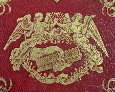
     At a glance, the 1850 edition of Robinson Crusoe by Daniel De Foe looks like just another one of the hundreds of editions of the classic work produced in the United States in the nineteenth century. But look closely, and notice the handsome device on the cover of the elaborately decorated binding. Beneath a tangle of iconography that includes angels holding hands, a radiant star, a bald eagle, and a laurel wreath, is something immediately recognizable to anyone who has set type: a hand grasping a composing stick. (Actually, if you look very closely, you'll see “Stick & Rule" engraved on the edge of the stick. We learned that this is an obsolete name for the composing stick used until the early twentieth century.) In the ribbon below the composing stick is the name “Journeymen Printers' Union." That organization, based in Philadelphia, is credited as the publisher on the title page, and one of its members edited this edition. The reader has only to turn another page to learn why the Union issued the book themselves, rather than one of the publishers that its members worked for.
     According to a two-page “Advertisement," the union was founded on June 27, 1850, “to improve the condition of the craft." One thing they did to achieve that end was to adopt a scale of prices — what we would call a minimum wage — for the various kinds of work its members did in newspaper offices, and in book and job offices. The scale went into effect on September 2, and while the majority of employers conceded to it, some employers refused to comply, which led to the dismissal of nearly one hundred union members from their jobs. The union went on strike against those employers, and decided to support the unemployed members by printing and selling this new edition of Robinson Crusoe. Our copy is from the third edition, following a first edition of 1,000 copies and a second edition of 2,000 copies. Ultimately, five editions totaling 17,000 copies were issued, but the venture cost the union money. Even though it was unprofitable, the venture was a great exercise in solidarity and fraternity, as the strike went on for nearly six months, and only a handful of members “left the cause to which they had solemnly pledged themselves and subscribed their names. These, in printers' language, are denominated rats, and as such, no doubt, they will find snares set by themselves at every opening to their lurking places."
     As the strike drew to a close, a meeting was held on December 2, 1850, in New York City, bringing together the Journeymen Printers' Union and representatives from similar unions in New York, New Jersey, Maryland, and Kentucky to form what would become the National Typographical Union, which was formally organized in Cincinnati, Ohio, on May 5, 1852. Philadelphia's journeymen's union became the Philadelphia Typographical Union No. 2.
     The future of organized labor must have seemed bright. We wonder if those printers of 1850 would be surprised to know that the struggle continues, 155 years later, “to redeem men from the virtual slavery into which they have been reduced by the unrighteous ascendency of capital."

Saturday, April 18, 2015

Ringling College Letterpress Students Visit the TBAS


Crossing Tampa Bay earlier this Spring, students of the Ringling College Letterpress and Book Arts Center (Sarasota) made their way to the TBAS, led by book artist Bridget Elmer, coordinator of the Ringling program. Our focus during their visit was to highlight two particular strengths of the Tampa Book Arts Studio: working typecasting machines and pre-1900 iron hand presses.

***
After welcoming the class and making introductions, Studio Director Richard Mathews began with a small tour of our “casting corner,” where the Intertype, the Monotype Composition and Sorts casters, and the Ludlow Typograph sit. He explained the workings and mechanics of each machine and spoke about their differences, advantages and disadvantages, and how each was typically used in commercial and book printing.


***
Following that initial talk the class separated into two groups. One group stayed to do hands-on work with the casters to set and cast their own lines of hot metal, while the other group moved to the hand press to ink and pull their own prints.

Letterpress Coordinator Carl Mario Nudi manned the Intertype, and after a bit of instruction had the students sit at the machine themselves to type their lines on the keyboard and cast their own slugs.


Both Carl and Studio Associate Joshua Steward split time helping students set large display type in Ludlow sticks and cast their settings on the Ludlow Typograph.


***
Because the students at the Ringling Book Arts Center primarily print using mid-century Vandercook cylinder presses for their projects, we gave them the opportunity to hand-ink and pull prints on our 1860s Hoe Washington iron hand press. In the spirit of Bridget Elmer’s other letterpress venture, Southern Letterpress, we had the students use a large hand roller to ink up the forme (a short quote by Benjamin Franklin, fittingly, a hand press printer himself) with a “rainbow roll”—a three-color gradient, blue to yellow to red.


Thanks to Bridget Elmer and the Ringling College Letterpress & Book Arts Center.
The TBAS is glad to add typecasting, hand-inking, and iron hand press printing
to the students’ growing knowledge and experience in letterpress printing.

Wednesday, February 18, 2015

The Itinerant Printer Revives a Printerly Tradition by Visiting the TBAS


Letterpress printer and book artist Chris Fritton turned the TBAS into his personal studio for a few days last week as part of his year-long project called “The Itinerant Printer.” Fritton is traveling the nation in part to renew the lost tradition of tramp printers—printers’ apprentices who left the Master Printer’s shop where they had learned the craft of printing to travel and see more of the world, finding work in other places and learning other printing techniques before opening their own print shops.

Taking advantage of Chris’s visit, two University of Tampa art classes stopped by the Studio to listen, watch, and print as they took part in informal presentations and demos. Chris explained the history of printing, showed the basic elements of letterpress printing and typecasting—having the students cast their own names on the Ludlow Typograph and print a class keepsake—as well as guiding them through his portfolio of prints and talking about his traveling “tramp printer” project.


***

Chris also set aside time to create and print some original letterpress works of his own. During his two-day visit, he designed, set up, and printed a three-color poster and two editions of two-color postcards to fulfill pledges that are part of his Indiegogo online fundraising campaign. Visitors were invited to stop by, talk with him, and see him at work during an Open Studio on Monday afternoon.


Chris officially began his Itinerant Printer tour, which is projected to take him to 48 states, the last week of January in the Miami area, making the Tampa Book Arts Studio only his third stop, following IS Projects (Ft. Lauderdale) and the Jaffe Center for Book Arts at FAU Libraries (Boca Raton). While in the West Central Florida area, Chris also visited the Letterpress and Book Arts Center at Ringling College in Sarasota and The Southern Letterpress in St. Petersburg before moving north to the Florida panhandle and Georgia.

More information about the Itinerant Printer project and a schedule of the tour can be found on the project website, itinerantprinter.com

Thanks to Chris Fritton (The Itinerant Printer) for his visit, and to Ina Kaur,
Jono Vaughn, the UT Art Department, the Dept. of English and Writing, Writers at
the University, and the College of Arts and Letters for sponsoring The Itinerant Printer.

Friday, February 13, 2015

A Celebration of Companion Old Style


The Tampa Book Arts Studio completed January 2015 by beginning its year-long celebration of the 150th anniversary of the birth of the great American type-designer and printer Frederic Goudy—a party capped-off by casting type from the only surviving matrices for his unique Companion Old Style types. The event centered around a talk given by Richard Mathews, Director of the TBAS, who described the impetus for the creation of the face, its design, and the history of the use of the typeface. Mathews, drawing from a large volume of research, including materials from our own Tampa Book Arts Studio Library Collections, began by discussing Goudy’s early life and his development as a type designer, moving into a discussion of Goudy’s first types and into the commission Goudy accepted in 1927 to create a new typeface for the Woman's Home Companion magazine. Mathews pointed out unique elements of the typeface itself and discussed the face in context with Goudy’s other types and ornament designs. The talk ended with the story of how amateur printer and type enthusiast Les Feller discovered the Companion Monotype matrices during the liquidation of Monsen Typographers in Chicago, and how the Companion matrices found their home at the TBAS.

As part of the event, two films were played on a loop that could be viewed whenever convenient by those who attended.  The first was a 2014 video interview with Les Feller, describing his discovery and rescue of the Companion matrices (click on video at right to play). Paired with it was The Design to The Print by Frederic W. Goudy, a silent film from the 1930s that enables the viewer to look over the shoulder of Goudy as he shows his process for creating a new type, from first drawings, to engraving the matrices, to casting the type.

***

Following the talk, the crowd moved from the classroom into the Studio where there were opportunities to ask questions of the associates, learn more about Goudy, and to see a demonstration of typecasting from the original mats on a Monotype Sorts Caster, which produces individual pieces of type just as Goudy did in his foundry. Designs by Goudy, enlarged photographs of Fred and Bertha Goudy, and enlarged, signed proofs were displayed, together with items from the TBAS collections, including original copies of Goudy’s type publication Ars Typographica, original copies of Woman's Home Companion, and the first book to be set entirely in Companion, Water Colors, published in 1979 by Konglomerati Press. Notable items of the display were a grouping of facsimiles of Goudy’s first, dated proofs of three sizes of Companion (courtesy of the Cary Collection at RIT), photographs of Goudy's home and studio at Deepdene, and a printed sample of Companion known to be hand-set by Berthaoverlaid over a photo of her setting type in a composing stick.


***

Casting on our Monotype “Orphan Annie” Sorts Caster from the Companion matrices themselves, TBAS Associate Joshua Steward demonstrated how Goudy’s original engraved Companion mats would have been used to cast type for hand-setting and printing. The 36-point Companion Italic capital “G”s that were cast on the machine as part of the demonstration were handed out as small tokens to take home for those who attended.


***

At the Studio’s Vandercook 4 printing press, Richard Mathews assisted attendees to print their own keepsake designed for the occasion and handset in 36-point, 18-point, and 12-point Companion roman and italic types. The broadside included decorative Bruce Rogers ornaments also cast on the Monotype. The broadside design will serve as the basis for a more elaborate limited-edition keepsake for a portfolio of tributes being assembled by the Rochester Institute of Technology as part of their 150th Anniversary of Goudy.


Thanks to those who attended the event and special appreciation to
Rich Hopkins for his Monotype typecasting advice and support