Sunday, December 14, 2014

A “Lost” Goudy Type Becomes Our New Companion


Goudy’s Companion Old Style Comes to the TBAS

A sample setting of Companion Old Style
arranged by Richard L. Hopkins
       A rare and virtually unknown typeface designed by the acclaimed American type designer Frederic Goudy now has a new home here at the University of Tampa. Thanks to a David Delo Research grant and the generosity of the Lester Feller Family, the only known surviving mats for Goudy’s Companion Old Style type have become jewels in the crown of the Feller Family Collections at the Tampa Book Arts Studio.
* * *
   
     Richard Mathews, Dana Professor of English and Writing at the University of Tampa, and Director of the TBAS, received a David Delo Research grant from the University of Tampa to acquire, document, cast, and write about Goudy’s little-known type, Companion Old Style.  As part of the grant he will give a talk on the history and discovery of the mats at the Tampa Book Arts Studio on January 31, 2015, where he will explain the background and design of the roman and italic fonts and demonstrate their casting on the Studio’s antique Monotype “Orphan Annie” caster.

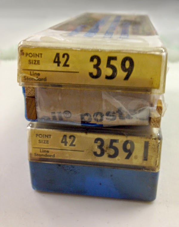
     The brass Monotype matrices arrived in sixteen battered plastic cases, each containing a complete roman or italic alphabet. They are the masters for casting an exceedingly rare private typeface, never made commercially available. Commissioned in 1927 by Henry B. Quinan, Art Director for the Woman’s Home Companion magazine, the type was designed for exclusive use in the magazine, which had a national circulation of more than four million in the 1930s. Goudy worked on the project for several years, during which time he taught himself how to engrave the mats, developing his own tools for cutting the shape of each letter, number, and punctuation symbol into a flat brass matrix designed for use on the Monotype casting machine. The finished types first appeared in the The Woman’s Home Companion for June, 1931. In the end, not only did he make the patterns for each letter, but he also cut each of the mats himself. The mats today include 12-, 14-, 16-, 18-, 21-, 24-, 36-, and 42-point sizes in roman and italic.

How Companion Made Its Way to the TBAS

     The mats were discovered and saved by Lester Feller in 1976 when the equipment of Monsen Typographers of Chicago was being liquidated. Feller, an amateur printer and type enthusiast who founded and operated the Twin Quills Press in Niles, Illinois, and later established the Printer’s Row Printing Museum in Chicago, collected antique types and cuts throughout the 1960s and 1970s for his serious letterpress hobby that he pursued from home base in a crowded garageAt the liquidation Les noticed the unidentified mats in custom Monsen Typographers plastic boxes with the Monotype number 359 identification, a number he was not familiar with, and he took a few mats out of the case to see if he could recognize the face. Though he couldn’t identify the type, he thought the slant of the letter “o” was interesting and he noticed that the old style numerals had a certain flair, and so decided to buy the mats without knowing what they were.

* * *

     Les later showed a one-line printed setting of the word “Companion” to Rich Hopkins at a meeting of hobby printers, the Almagamated Printers Association Wayzgoose in Indiana in 1977, still not knowing what he had. Printers often saved scraps and type samples from job work that could show what a typeface looked like, and Les thought that “Companion” might be a word from a headline or ad to show the type. It certainly didn’t strike him as the name of a type, let alone being a type designed by Frederic Goudy. He had unsuccessfully looked through Monotype lists in various catalogs and specimen books, but he had not been able to find number 359. Hopkins was also intrigued, and turned to his own extensive references, including two different typeface encyclopedias, but the mats were not listed in any of the usual sources.  Rich remained on the chase, following various clues that eventually included that one-line sample word, and he was able to identify the mats as Companion Old Style, an exclusive, private type commissioned by the art director of the Woman’s Home Companion, and used exclusively by the magazine.

* * *

     In 1979 Rich Hopkins wrote the whole story of the discovery and identification of the type in a beautifully printed issue of his Typographic Curiosities, set in Companion types cast from the mats that Feller had loaned especially for the booklet. Dr. Richard Mathews, who was directing the Konglomerati Florida Foundation for Literature and Book Arts at that time, knew Rich through the American Typecasting Fellowship and soon heard about the Companion discovery. He contacted Les and was able to arrange to have enough of the type cast to complete the first book ever issued in the private typeface: a collection of poetry by Ohio poet Hale Chatfield entitled Water Colors. Published in 1979, it was typeset by hand in Companion, letterpress printed, and hand bound at Konglomerati Press, with partial funding by a grant from the National Endowment for the Arts.

     Feller and Mathews had lost touch over the years since then, but as the Tampa Book Arts Studio was first taking shape a decade ago, they made contact again. Les and his wife, Elaine, were spending winters in Florida, and they arranged to stop at the University of Tampa to see the new setup.  Presses, type, and typecasting equipment from Konglomerati had been supplemented by donations from others, and the growing collection reminded Les of what they had hoped to do with the Printer’s Row Printing Museum: inform and inspire others with an appreciation of the history and the desire to keep the equipment in use.
     
Future Legacy of Companion at the Tampa Book Arts Studio

Les Feller speaking about his 1979
discovery of the Companion mats
     Les and Elaine established the Feller Family Collections as part of the special collections library of the Tampa Book Arts Studio. They have contributed hundreds of original antique printer’s blocks from the early twentieth century children’s books published by the Donohue Company of Chicago, antique letterpress models, displays of wood-engraving processes, hundreds of printed books and pamphlets on letterpress printing, and a collection of antique letterpress posters and broadsides from the seventeenth through the nineteenth century. Many of these are framed, and now hang permanently in the TBAS.
* * *

     Today the Companion Old Style types will form a unique living legacy as the highlight of the Feller Family Collections, offering a very special opportunity for students to handle a private typeface found nowhere else in the world. Faculty and students together will explore new ways of utilizing this distinctive and nearly lost typeface by America’s best-known and most prolific type designer.  Here it will be cast sparingly and used for special projects. Most importantly it will offer students a hands-on experience with history. In the process, they will also contribute to history and scholarship themselves as they find ways to feature and reveal the possibilities for expression that this virtually unknown typeface holds.

Frederic Goudy wrote of Companion in his book A Half Century of Type Design and Typography 
“Companion Old Style and its italics show greater consistent
original features than any other face I have ever made.”

The Tampa Book Arts Studio is thrilled to be the permanent home for this extraordinary type.

Friday, October 24, 2014

TBAS Letterpress Coordinator Visits Lead Graffiti in Delaware

Jill Cypher and Ray Nichols in the Lead Graffiti studio, Newark, Delaware.
      When Tampa Book Arts Studio Letterpress Coordinator Carl Mario Nudi headed North last month to visit relatives and friends, he was happy to see that his road trip would take him near Newark, Delaware, where the creative letterpress studio Lead Graffiti is located. Jill Cypher and Ray Nichols, the studio’s owners, greeted our “itinerate inquirer of all things letterpress” with gracious and overwhelming hospitality. 
 
      Lead Graffiti not only produces unique and innovative books, broadsides, and other book arts pieces, but Jill and Ray, and Ray’s son, Tray, also do commercial letterpress commissions. They work with traditional materials in surprising and contemporary ways. Their studio resources include a variety of traditional wood and foundry types, supplemented by new and wonderful wood type that they have designed and manufactured entirely in-house.
An example of the wood type made at Lead Graffiti.
 
      During Carl’s visit, Jill and Ray generously took the time to show him around and explain some of their techniques.  They also presented him with some inspiring samples of their work to share with the TBAS associates. One of the most interesting broadsides is from the 2014 series of their “Tour de Lead Graffiti” project. The sample print they sent back to Tampa is one of twenty-one posters interpreting the stages of this year’s Tour de France bicycle race held in July in France and nearby European countries.

Some of this year’s posters from Tour de Lead Graffiti.

      Each day during the Tour de France, Jill, Ray, and a team of collaborators watched television coverage of the race and related activities to soak up the atmosphere, and to catch some of the memorable commentary, interviews, and incidents. They would then go to lunch and discuss how to translate and interpret their impressions into a poster using wood and metal types, decorative elements, and colored inks on a 14.5” x 22.5” sheet. What is immediately obvious about this project is the spontaneity that the finished work communicates. Even the composition and lockup were done directly on the bed of their Vandercook press without preparation.
 Bringing the Tour to TBAS.


      The posters are limited editions—this year being the fourth in their yearly series—and copies of many of them remain available for purchase. Check out Lead Graffiti’s web site to see more of the series, along with some of the other great stuff they are doing: www.leadgraffiti.com/


Monday, August 11, 2014

Summer Project: Proofing Antique Donohue Blocks from the Feller Family Collections

Carl Mario Nudi, at the Vandercook 4 in the background, has already completed more than two hundred proofs.

One of the most interesting projects this summer has been the proofing of our complete holdings of antique blocks from the M. A. Donohue & Company of Chicago.  The blocks are just one component of the Les Feller Family Collections now at the Tampa Book Arts Studio. Letterpress Coordinator Carl Mario Nudi is leading the effort, with help from Joshua Steward, Caitlin Carty, and others. The project involves unwrapping each block, cleaning away at least the first layers of accumulated ink, dust, and dirt with the help of brushes, toothbrushes, and a variety of solvents, and pulling a proof.
One cover block after cleaning, ready to be inked and proofed.


Carl Mario Nudi pulls a proof from the block.
When the project is finished, the studio will have two complete notebooks of proofs that will serve as a catalog of all the blocks in the Feller Family Collections. Donor Lee Harrer and others are already busy locating actual books to match the plates, and this week Carl found a copy of The Natural History ABC.  His copy of the complete book arrived just after he had finished proofing that set of blocks. But, as is often the case with Donohue Company books, the interior and exterior blocks are not always paired consistently from printing to printing. The inside blocks in the case of Natural History are completely different in this physical copy from the blocks held in our collection. This appears to be a standard practice of the company, which supplied young children with interesting and inexpensive books. Donohue & Co. evidently reprinted quickly to replenish stocks, and they appear to have been happy to swap around the texts, as long as they made sense. The outside covers are identical, and both our blocks and the printed book are identified as Series No. 120.
The printed cover, together with our first proof of the black block, which still needs makeready.
Most of the interior blocks in our collection include the signature of the illustrator, Constance White; however, the interior pages in the printed copy are by multiple illustrators—W. A. Cranston, Stanley Berkeley, and Harrison Weir—and they show a range of dates from 1873-1890.  Neither the printed copy nor the set of blocks is dated, though our blocks appear to have been made sometime between 1900 and 1920.

With summer nearly over, there is still a great deal of proofing to be done to complete the project, but each printing session brings fresh discoveries and delightful surprises.  We are looking forward to knowing much more about the full archive—which includes well over four hundred blocks—and about the Donohue Company by summer's end.

Joshua Steward proofs another sheet on the Vandercook 4.


Friday, August 1, 2014

TBAS Library Highlights: Rare Book from American Printer Isaiah Thomas


A battered, heavily worn leather binding from the nineteenth century conceals one of the gems of the Tampa Book Arts Studio Library Collections: the Columbian Dictionary of the English Language published in 1800 by the great American printer and patriot Isaiah Thomas in partnership with his friend and fellow publisher Ebenezer T. Andrews.

Our copy is a gift from our collections chief, J. B. Dobkin, and is one of only nine surviving copies that we have been able to locate in libraries throughout the world. Dobkin describes it as "extremely rare."   Our copy is inscribed with the name of John Lesslie, who lived with his wife, Polly Hyde, in Plymouth, Vermont.

The book was compiled by Yale-educated Massachusetts teacher Caleb Alexander and includes “many new words peculiar to the United States, and many words of general use not found in any other English Dictionary.”  The elaborate title page also states that “the whole is calculated to assist foreigners in acquiring a just pronunciation of the English language, and to be used as a school book by any who wish to study the language grammatically.”

Isaiah Thomas was born in Boston in 1749 and in his youth was apprenticed to a printer.  He is widely known for his publication of the famous eighteenth-century newspaper named the Massachusetts Spy, which he established just about the time he turned twenty-one. In it he championed American Patriot politics from 1770 to 1776 and the outbreak of the Revolutionary War.  Thomas also printed and published the New England Almanac (1775-1803), published many other important books, established a paper mill, and wrote and published the first comprehensive printing history in the U.S.,  The History of Printing in America (1808).


Thursday, July 3, 2014

TBAS Library Highlights: One of our favorite things

So many gems are tucked away in the Tampa Book Arts Studio library that it’s difficult to choose one to inaugurate this series of posts about the “best” of the collection. We plan to feature one item, or a related group of items, regularly on this blog, so check back often and see what we've brought out to delight you. Since there are nearly 8,000 items in the collection, it will be a long time before we run out of the “best” of what we have to share.

     We decided to begin the series with the copy of An Essay on Typography that came to us as part of Lee Harrer's generous donation. This first edition was published in June 1931 in an edition of 500 copies. Eric Gill (1882-1940) not only wrote and illustrated the book, he also printed it by hand, with his son-in-law, Rene Hague. This book exemplifies Gill’s versatility. His great talents complemented one another in the fields of sculpture, type design, writing, illustration, engraving, and printing, and he made this book at a high point in his career, having just completed the design of Gill Sans types and finished a major sculptural commission for reliefs on the headquarters building overlooking St. James's Park for the Underground Electric Railways Company of London, which was awarded a London Architectural Medal in 1931 from the Royal Institute of British Architects.
    Gill first trained to be an architect, but gave it up after meeting and studying with the renowned calligrapher Edward Johnston. After that meeting, he became interested in calligraphy and the cutting of letters in stone, and the art of sculpture generally. His work exemplifies the Art Deco style and unashamedly portrays human sexuality and the body. He and his wife moved to Ditchling in Sussex, England, in 1903, where he founded the Guild of St Joseph and St Dominic after World War I. The Guild and the workshops he established later were communities of craftsmen that put into practice the anti-industrial ideas that Gill propounded in essays on art and the modern world.
     His career took a new turn after Stanley Morison, the type designer most famous for the ubiquitous Times New Roman, invited Gill to design new type faces for the Monotype Corporation. The results of their collaboration include Perpetua, Gill Sans, and Joanna. American type designer Beatrice Warde was also employed at Monotype when Gill was working for them, and was inspired by Gill’s Perpetua type to write her famous broadside titled "This Is a Printing Office." (Warde was also the model for his woodcut of a female nude called “La Belle Sauvage.”) The Joanna type was specifically designed for Gill’s own press, and he used it to set An Essay on Typography. The year 1931 also marked the publication of Gill's masterpiece in the field of book design: The Four Gospels, published by the Golden Cockerel Press.

Tuesday, June 24, 2014

Christmas in Midsummer for TBAS Library

The Tampa Book Arts Studio Library Collections received an unexpected summertime visit from Santa Claus as donor Lee J. Harrer brought in some special vintage gifts that complement and showcase the antique printing blocks in our Les Feller Family Collections.  Lee is extending the Harrer Collection of Books about Books to include original editions published by Donohue & Co.  of Chicago that are printed from the antique blocks that were rescued and preserved by Les Feller, who discovered them in the vaults of the Chicago printer. They are now a treasured part of the TBAS Feller Family Collections. (See our post about a title, Jolly Jingles, discovered early on in the Collection.)

This color cover is from the Santa Claus Big Picture Book published by Donohue about one hundred years ago. The Feller Collection blocks include many sets of four-color separations, along with some engravings intended to be printed in a single color.  The Studio plans to produce limited-edition prints from the original blocks and will be making them available in portfolio sets as a fundraising activity.  Meantime, we look forward to being inspired by antique examples of the original printings, thanks to Lee’s book-collecting skills and generosity.

If you happen to have original children’s books from Donohue and Company that you would like to contribute to the library, please contact us at utpress@ut.edu.

Friday, June 13, 2014

23 Students Take Letterpress Printing and Publishing Course

THE TAMPA BOOK ARTS STUDIO WAS FILLED TO OVERFLOWING this Spring with twenty-three University of Tampa students enrolled in a course entitled “Printing, Publishing & Book Arts.” The course was taught by University of Tampa faculty members Richard Mathews, director of the studio and a professor of English and Writing, and Kendra Frorup, a sculptor and mixed media artist and a professor of Art, assisted by the TBAS Letterpress Coordinator Carl Mario Nudi and Studio Associate Joshua Steward. The class met every Monday, Wednesday, and Friday during the 14-week semester.

Students surveyed the history of printing and publishing from incunabula to contemporary artists’ books.  They studied type design and typography from historical and digital angles, and they explored hands-on aspects of letterpress printing.

Nearly every available surface in the studio was utilized while students learned typesetting by hand from the California job case. As they became more familiar with the types available to them, they designed and printed limited edition postcards, larger broadsides with two or more colors, and they planned and completed a variety of individual projects. Most of the students also learned to set and cast lines of type on the Ludlow Typograph, which gave them an even broader selection of type styles and sizes than those found in the cases of vintage foundry types in the studio.  

Frorup instructed students throughout the semester in the making of paper and showed them techniques for producing decorative paste papers and marbled papers. She also taught the students several binding techniques and worked individually with them to help them master different stitches and book forms. Everyone completed at least one binding exercise employing the pamphlet stitch and another using a stab binding.


They also gained experience and confidence in using the array of letterpress equipment in the studio, from composing sticks to galleys to furniture and quoins.  They all completed limited edition letterpress runs using our Vandercook presses—a Model 4 and Model 219AB. They took on the responsibility of printing the work they designed, which involved setting, proofing, and correcting their type, preparing and locking-up forms, and registering their sheets.

The last weeks of the course became a time for experimentation with different materials and with the traditional forms of printing. A few tackled split fountain (or “rainbow roll”) printing, others tried their hand at carving wood or linoleum blocks, monotype printing, collography, screen printing, hand-tinting, and even wood working. The students’ final projects were varied. Many included binding as well as printing, and some created chapbooks of poetry, stories, or essays. The course concluded with a session for the students to show and comment on the work they had done—and to collect all of the letterpress postcards into a die-cut and letterpress-printed portfolio packet designed to hold a complete class set (shown in slideshow below).


Click on photos within the slideshows to see larger versions

Special thanks to Jennifer Deg and Jack Whitaker for additional photographs

Thursday, June 5, 2014

Jim Servies, 1925-2014


FAMILY, FRIENDS, AND ADMIRERS of Jim Servies are mourning his passing in Pensacola, Florida, on May 30, 2014, at the age of 88. He was a champion of books and print culture throughout his long life as a librarian, author, editor, printer, publisher, and bookseller. After graduating from the University of Chicago, he began his career as a librarian there, and then served in various positions at the University of Miami (Coral Gables), the College of William and Mary, and the University of West Florida.
     During those years, Jim edited or wrote a number of books, including A Bibliography of John Marshall (1956), A Selected Bibliography of Virginia, 1607-1699 (1957), Earl Gregg Swem, A Bibliography (1960), The Poems of Charles Hansford (1961), and The Log of H.M.S. Mentor, 1780-1781 (1982). His work on these publications, and his experience as a reference librarian, prepared Jim to tackle a book that would be nearly two decades in the making: A Bibliography of Florida. First, Jim and his wife Lana spent four years cataloging more than 40,000 (yes, forty thousand!) books, articles, and other documents printed in or about the state of Florida. Then, after Jim retired in 1986, they began to work in earnest on their magnum opus. It would be published in four volumes between 1993 and 2002, totaling more than 2,000 pages and 18,052 entries. Michael Slicker of Lighthouse Books in St. Petersburg calls it “one of the (if not the) finest state bibliographies ever produced.” 
     Jim and Lana were active in the world of antiquarian books as proprietors of King and Queen Books, which has issued nearly 50 catalogs. They helped found the Florida Antiquarian Booksellers Association and its much-admired book fair, held annually in St. Petersburg.
     The name King and Queen was also used for their press, which issued occasional hand-printed keepsakes, facsimiles and ephemera, many of which have a Christmas theme. The long list includes The Angels [by John Updike] (1968), An Ode to the King and Queen Press (1968), Christmas All Hail! (1969), The Office of Christmas (1974), Christmas Couplets (1975), Pensacola’s First Christmas Tree! (1978), Welcome Christmas (1979), A Christmas Tree Question (1980), A Christmas Shopping List: 1902 (1982), The New-Year Elephant (1983), A Florida Christmas, 1882 (1986), Holiday Recipes, A.D. 1594 (1988), Christmas Eve at Sea (1989), Little tree, little silent Christmas tree (1990), A Christmas Orange (1991), Florida: A Hundred Years Hence (1992), Christmas on Mt. Olympus (1993), The Eskimos’ Christmas (1997), Jennie’s Christmas, 1901 (1998), and Christmas in the Bag: A Major Jones Story (1999).
     Jim’s friend and colleague Michael Slicker remembers him as “a man of tireless energy and a friend of the book who guided the University of West Florida Library through its early years, sent hand-printed keepsakes from time to time, supported the book fair in its early years, and was always willing to share his time and his knowledge. Moreover, he was a ‘gentle’ man in every sense of the word.  The world is a little darker today without the light of Jim's smile.”

Thursday, January 23, 2014

Book Arts Studio Associates See Stars after Hosting Whirlwind Demonstrations and Tours


The Tampa Book Arts Studio associates were literally “seeing stars” recently as they played host to more than eighty graduate students in Creative Writing. They were here as part of the low-residency MFA program that draws students from all over the world to take part in an intensive ten-day residency of lectures, writing workshops, seminars, and readings. And the stars were being freshly cast in type metal as part of the celebration.


The student visit to the TBAS began in the early afternoon with a presentation by the Studio’s director, Richard Mathews, offering a broad overview of the history of the written word and its printing and publishing developments through time. In a later presentation given to third- and fourth-term students, more advanced topics were discussed. These included questions about the long-term effects on reading habits as a consequence of increased consumption of digital and  web-based texts. He described issues raised by Nicholas Carr in The Shallows: What the Internet is Doing to Our Brains, which include preliminary evidence that there is a subtle (and subversive) training of the brain by digital culture to interact with digital texts in fast and superficial ways, with a consequent loss of deep thought and craftsmanship in digitally-created texts. He concluded the presentation by referring to historical and modern writers-as-publishers, reminding them that writers themselves can have a deep and profound impact in shaping how and what we read.

Dr. Richard Mathews lectures on the history of the printed word and advent of the codex.

Following the presentation, the students tried their hands at traditional book crafts. Kendra Frorup and Carlos Camargo Vilardy, of the UT Art Department, showed them how to create paste papers and marbled papers, and Bridget Elmer—of The Southern Letterpress, Gulfport, Florida, and Coordinator of Ringling College of Art and Design’s Letterpress and Book Arts Center—gave demonstrations on book binding, case binding, and pamphlet stitching.


Kendra Frorup and Carlos Camargo Vilardy demonstrate paste paper techniques. 

Bridget Elmer discusses elements of bookbinding by hand.

Meanwhile, at the letterpress studio, students visited three stations that represent the craft of letterpress printing. First, Dr. Mathews explained Gutenberg’s method for casting individual pieces of type by pouring molten metal into a hand mold, sorting it into a case, and setting it into lines by hand. 


Dr. Richard Mathews explains handset type and hand casting.


At the second station, Joshua Steward of UT Press ran a vintage 1920s Monotype Sorts Caster (the “Orphan Annie”) which mechanized the casting of individual letters and decorative pieces. Students could choose one of three different 18-point star ornaments to be cast on the machine and kept to commemorate the event.


Tampa Press Editing and Publishing Assistant Joshua Steward answers questions
about casting type and ornaments on the Monotype Sorts Caster.

Two of those three ornaments were used on a broadside, created by the TBAS staff in preparation for the event, as another keepsake for the students. As part of the tour, each student printed, with the help of TBAS Letterpress Coordinator Carl Mario Nudi, the second and final run of the commemorative broadside on the Vandercook.

TBAS Letterpress Coordinator Carl Mario Nudi talks with students
about printing on a Vandercook Proof Press.

* * *


“We'll keep on until we're in star country”


The concept of the broadside's design was multi-purpose: the quote used—“We'll keep on until we're in star country”—is taken from a quiet moment of dialogue between two characters in the novel The Tilted World, by Tom and Beth Anne Fennelly, visiting authors for the Residency who gave a reading for the students later that evening on campus; additionally, as this semester marks the completion and graduation by the students of the inaugural cohort of the MFA in Creative Writing program, these graduates are the first to take the knowledge they've gained and strike out into the expansive world of creative writing and other fields of their interest—each reaching for their own “star country.”


Stars and display type were cast on the Ludlow and Monotype Casters, with the colophon handset; the broadside was printed with process black and tinted-blue inks on Crane's Lettra Pearl stock.


* * *

Thanks to Rich Hopkins for the loan of his star Monotype matrices,
and to Kendra Frorup, Carlos Camargo Vilardy, and Bridget Elmer
for their time, effort, and willingness to share their extensive knowledge.

Saturday, January 18, 2014

A Gift of Fine Books from Lee J. Harrer Enriches and Deepens Our TBAS Library


A SIGNIFICANT DONATION by bookman Lee J. Harrer from his personal collection of books about books helped launch the Tampa Book Art Studio Library Collections in 2008. This year he helped us celebrate the holiday season by adding some 2,200 additional items to the collection with a gift appraised at more than $117,000.

Highlights of the new materials include important letterpress books from some of the major contemporary fine presses: Henry Morris’s Bird & Bull Press, John and Rosalind Randle’s Whittington Press, and Jan and Crispin Elsted’s Barbarian Press, to name a few.

One component with special resonance for us is a fascinating body of items from the estate of Helen Lee, who was the Director of Type Sales for many years at the MacKenzie-Harris Type Foundry in San Francisco. Unique items include signed woodcut proofs from Barry Moser, letterpress ephemera of many kinds from private press printers, signed trials and proofs from private presses, and even some assorted correspondence.


One of the most unique items in this group is a paper placemat inscribed and presented to Helen Lee for her birthday in 1982. It features an elaborate bird and heart pierced by an arrow, drawn by the artist Valenti Angelo (whose books are a feature of the TBAS collection), and signatures by Oscar Lewis, a leading member of the Book Club of California; Tommie Tommassini, President of the National Printer’s Association; and George Robert Kane, a noted bookseller.


Already in our collection and complementing these new items from the Helen Lee estate is a vintage MacKenzie-Harris Type Foundry catalog donated by Calligrapher Ruth Pettis, who worked with Konglomerati Press for many years. The Konglomerati types and presses now form the heart of the Tampa Book Arts Studio, and some of the types were purchased from Helen at the M&H Foundry.

With the addition of this new gift, the Tampa Book Arts Studio Library Collection has grown to more than 7,700 items.  We will be featuring some of the highlights from Lee’s most recent donation on our blog throughout the coming year. Thanks to the generosity of Lee Harrer—and with the substantial additional gifts and collections from J. B. Dobkin, the Les Feller Family, and many generous individuals—the students in our Printing, Publishing, and Book Arts classes will have a chance to see examples of some of the finest printers in the world.

When these new gifts are combined with earlier donations, the value of the Lee J. Harrer Collection of Books about Books exceeds $426,000.  Lee is now at work on a third donation that includes his miniature books and related press ephemera, runs of book-related periodicals, and new limited-edition, fine press items such as the Barbarian Press magnum opus on type ornaments of the Curwen Press, Bordering on the Sublime.