
So many gems are tucked away in the Tampa Book Arts Studio library that it’s difficult to choose one to inaugurate this series of posts about the “best” of the collection. We plan to feature one item, or a related group of items, regularly on this blog, so check back often and see what we've brought out to delight you. Since there are nearly 8,000 items in the collection, it will be a long time before we run out of the “best” of what we have to share.
Gill first trained to be an architect, but gave it up after meeting and studying with the renowned calligrapher Edward Johnston. After that meeting, he became interested in calligraphy and the cutting of letters in stone, and the art of sculpture generally. His work exemplifies the Art Deco style and unashamedly portrays human sexuality and the body. He and his wife moved to Ditchling in Sussex, England, in 1903, where he founded the Guild of St Joseph and St Dominic after World War I. The Guild and the workshops he established later were communities of craftsmen that put into practice the anti-industrial ideas that Gill propounded in essays on art and the modern world.
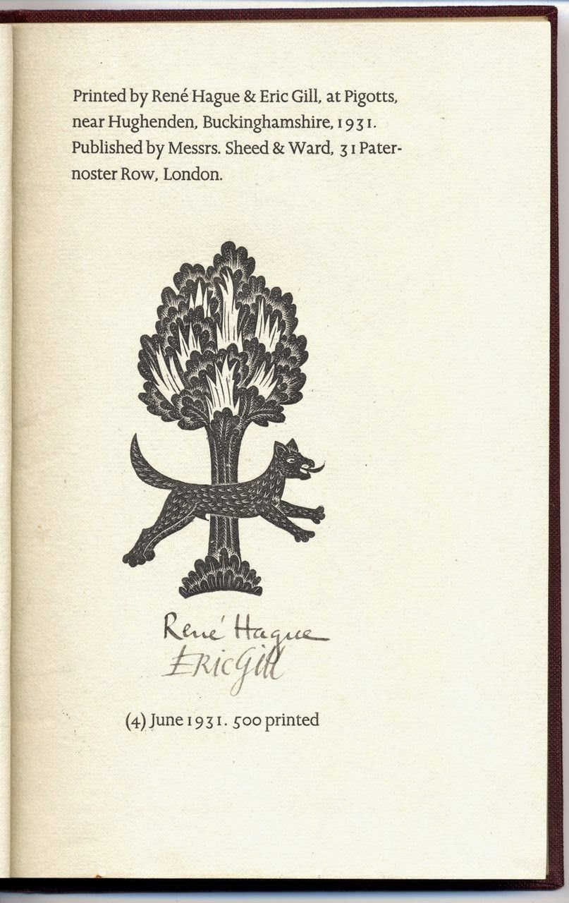
His career took a new turn after Stanley Morison, the type designer most famous for the ubiquitous Times New Roman, invited Gill to design new type faces for the Monotype Corporation. The results of their collaboration include Perpetua, Gill Sans, and Joanna. American type designer Beatrice Warde was also employed at Monotype when Gill was working for them, and was inspired by Gill’s Perpetua type to write her famous broadside titled "This Is a Printing Office." (Warde was also the model for his woodcut of a female nude called “La Belle Sauvage.”) The Joanna type was specifically designed for Gill’s own press, and he used it to set An Essay on Typography. The year 1931 also marked the publication of Gill's masterpiece in the field of book design: The Four Gospels, published by the Golden Cockerel Press.
No comments:
Post a Comment